
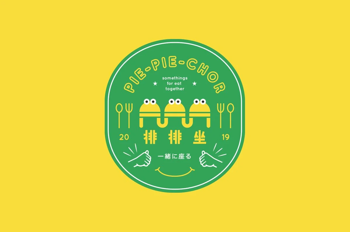
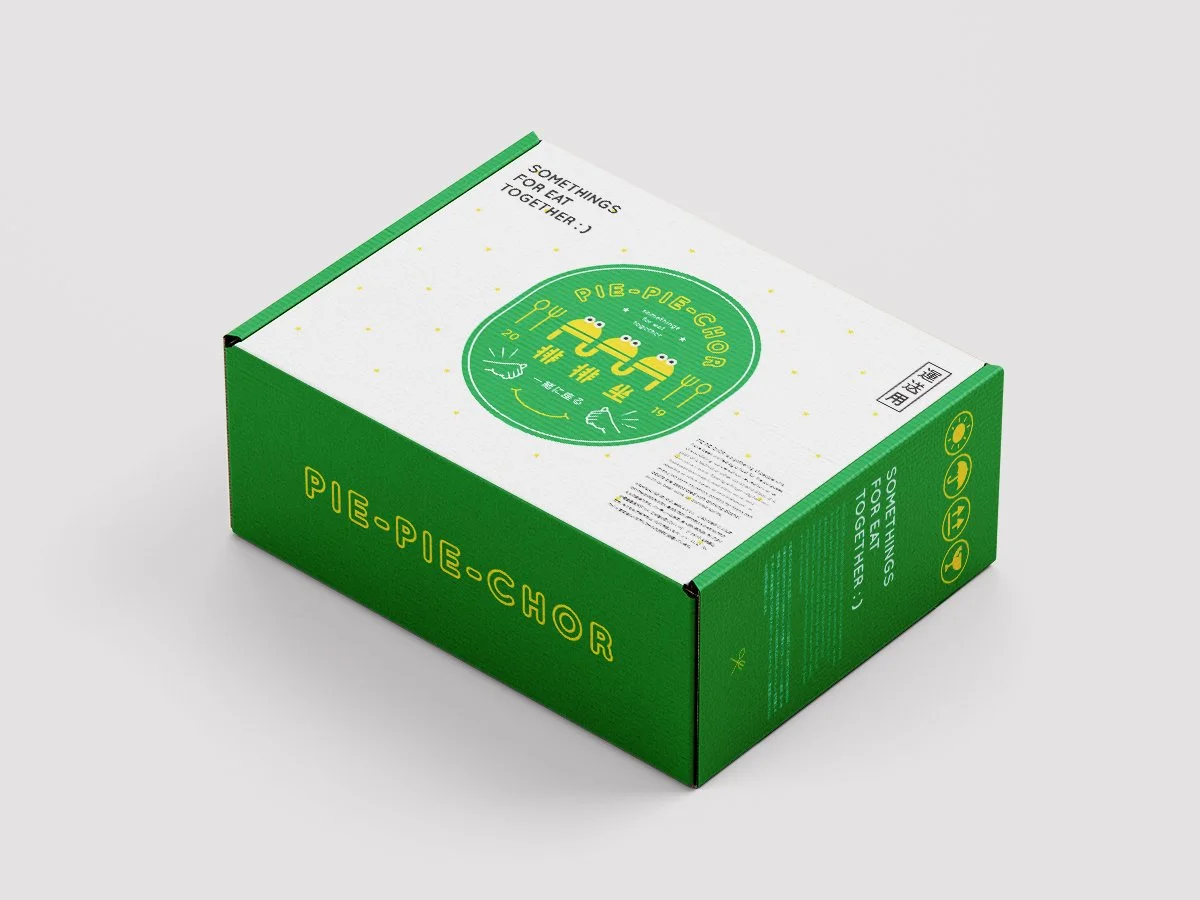
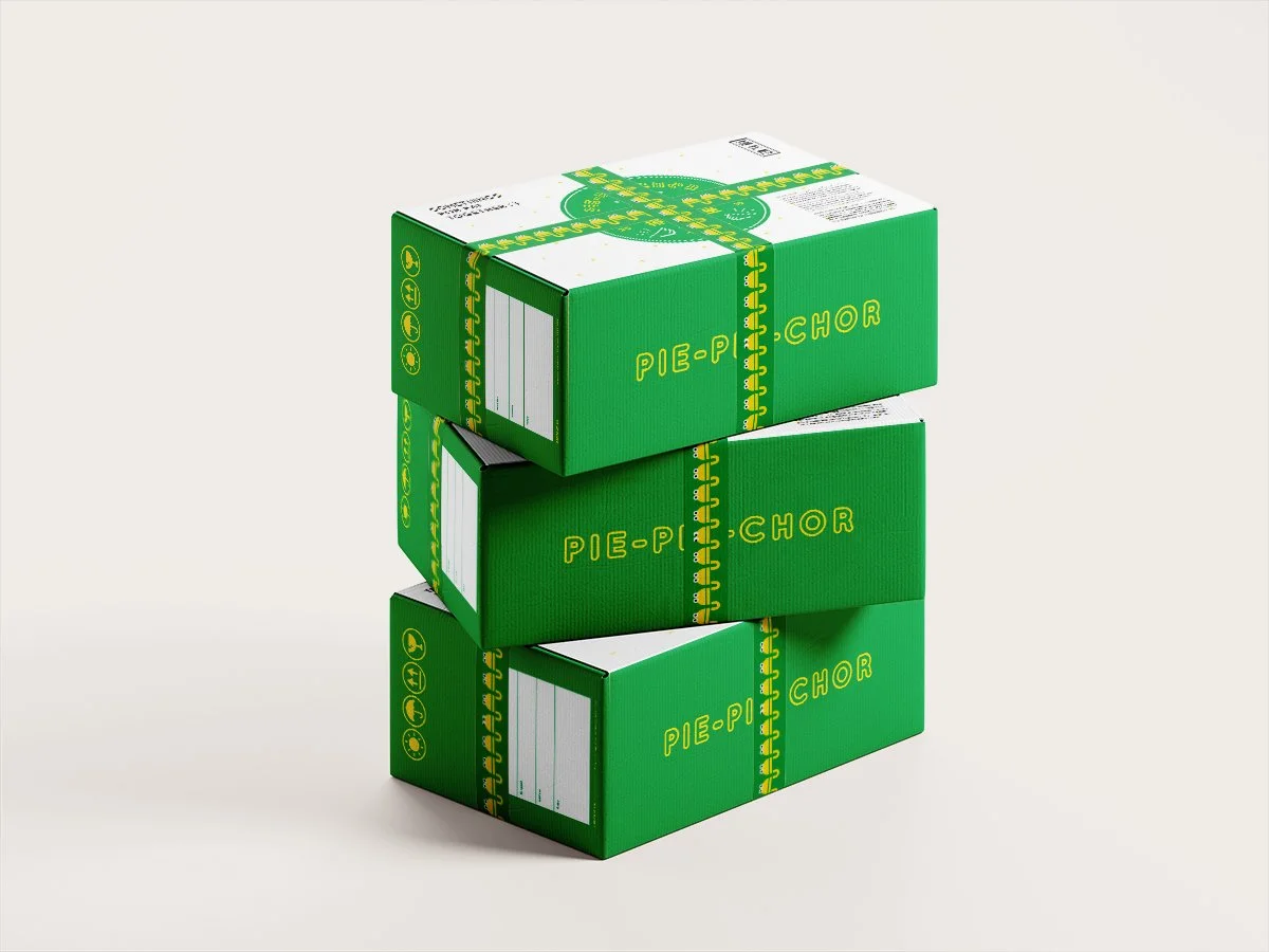
排排坐原定為一家家庭式作業的網上食材商店,主要銷售水果及急凍食品,依照著客人的想法,我們負責了品牌的命名、概念重整、標誌及包裝設計,排排坐三字取自於香港童謠《排排坐、吃粉果》,喻意大家坐在一起進餐﹐同時希望藉童謠的固有印象,營造出品牌快樂和輕鬆的氛圍,而刻意只選取排排坐三字作為名字,是希望讓吃什麼這句留白,同時亦想表達只要能齊齊整整坐在一起的話,其實吃什麼都可以。
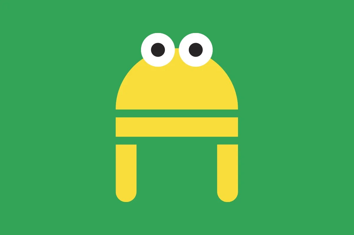
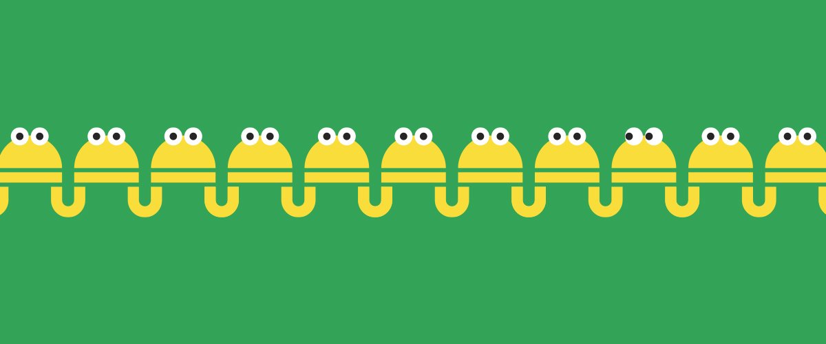
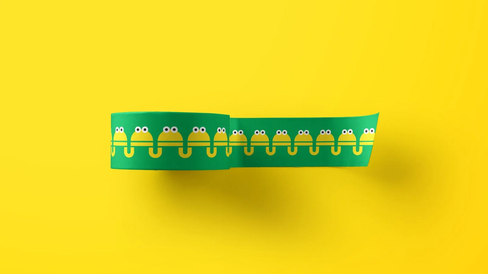
標誌設計以傳統開張花牌作為靈感,以增加標誌整體的喜慶感,同時我們亦為品牌設計了角色「PIE」,並以複數的形式放到標誌當中,象徵著排排坐,亦由於品牌主力引入日本食材的關係,標誌上也刻意配上簡單的日語作為輔助。
整個構思由命名到標誌設計都非常有趣,可惜其計劃最終因種種原因及疫情關係而遭到擱置。
PIE-PIE-CHOR was originally a family-run online grocery store selling fruits and frozen foods. We handled the brand naming, concept restructuring, logo, and packaging design. The name comes from the Hong Kong nursery rhyme "排排坐、吃粉果" symbolizing coming together for a meal. By focusing on these three characters, we aimed to leave the question of what to eat open, suggesting that it doesn't matter as long as everyone is together.
The logo was inspired by grand opening flower stand designs to add a festive feel. We also created a character named "PIE" to symbolize togetherness and included simple Japanese text as support. The concept was engaging and fun, but unfortunately, the project was ultimately put on hold due to various reasons, including the covid-19.